top of page

One Artist [NOT LIMITED TO] One Style

Panels
Click on an image to see complete view.
 October Sky48h x 60w varnish finish. A long exposure photograph of the night sky reveals an array of hidden colors and formations. This image is my interpretation of a photo I took out away from the light pollution areas of the city. | ![Washed[MELTED]Away](https://static.wixstatic.com/media/23a2df_db8d17ba1225453998e938dbedbceeb2.jpg/v1/fill/w_250,h_410,al_c,q_90,enc_auto/23a2df_db8d17ba1225453998e938dbedbceeb2.jpg) Washed[MELTED]Away48h x 29.5w. The darkness giving way to the colors of light. |  The Last Thing I Needed48h x 36w. "The First Thing This Morning". The title of this piece is a reference to a Willie Nelson song wherein he sings of all the inconveniences of a bad morning made worse by the departure of his significant other. This piece shows a messy, maybe even chaotic background and then a rain shower on top of that. Ever have one of those days? They happen, but the day can be redeemed with a little extra effort. |
|---|---|---|
 TBD29.5h x 48w. Commissioned by a longtime friend...image to remain obscured until revealed to patron. | 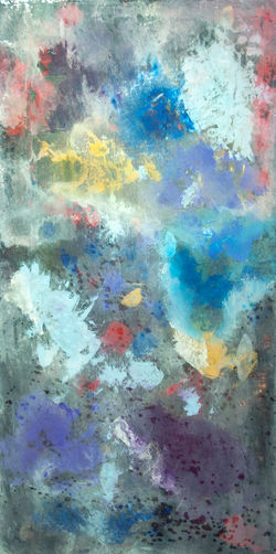 After the Flood...All the Colors Came Out. After being previously obscured, these colors are breaking through the darkness. The title is inspired by (you guessed it) a line from a U2 song.This piece has a companion piece which depicts more of the darkness which sometimes overcomes one. It is a picture of hope, future and overcoming. |  Staring at the Sun40 1/2h x 48w - The field of yellows and blues reminds me of days spent on the beaches of Florida, reading and napping under canvas umbrellas. But, one upward glance past the umbrella leaves one with bright spots that remain on the retina for a time. Postponed reading, hastened napping. |
![Gray[PURPLE]](https://static.wixstatic.com/media/23a2df_42efc1a73e694d16b44790bb5ce6eab9.jpg/v1/fill/w_250,h_420,al_c,q_90,enc_auto/23a2df_42efc1a73e694d16b44790bb5ce6eab9.jpg) Gray[PURPLE]40h x 24w. This piece is highlighted by ridges of color which emerge from deep under multiple layers of paint. The overall gray tone gives way to the purple from another layer revealing the perceived depth of the piece. | ![Sweet Cacophony[FRONT ROW]](https://static.wixstatic.com/media/23a2df_2ee8c0e656464c7d8c843c78a5958845.jpg/v1/fill/w_250,h_119,al_c,q_90,enc_auto/23a2df_2ee8c0e656464c7d8c843c78a5958845.jpg) Sweet Cacophony[FRONT ROW]24h x 48w. Imagine your favorite band. You are seated in the first row or standing up near the front. The band takes the stage to the flash of a thousand lights and the roar of the first notes to your favorite song. The sound waves blowing past you like the exhaust of a jet engine. So loud it hurts, so sweet it engulfs. The darkness of the arena is broken by the brilliance of dazzling light effects. My ears ring and my head hurts just thinking on it. Tomorrow we'll talk about it, loudly, | ![Fire[SMOKE]](https://static.wixstatic.com/media/23a2df_6429d77f43c04cad9e134b0d1f64935a.jpg/v1/fill/w_250,h_223,al_c,q_90,enc_auto/23a2df_6429d77f43c04cad9e134b0d1f64935a.jpg) Fire[SMOKE]48h x 52w. What started out as a predominately black piece with a few colors breaking through turned out completely the opposite. Multiple alternating layers of black, light blue permanent with splashes of random colors and finally a white wash gave this piece much greater depth than I imagined. On viewing close in, one might notice the veins of color coming from underneath are repeated in the broader areas of color near the surface. |
 Red Band Expanse48h x 40w. Steeped in rich, deep hues, this piece contains hints of metallic sparkle as well as splashes of green and purple shades. For me, this makes me think of the sky at night seen from out in the country away from the light pollution of the urban centers. The night expanse is flush with colors when seen in a long-exposure photograph. | ![Orange[RED]](https://static.wixstatic.com/media/23a2df_208311a01dec48bc8138e5f64eca7db9.jpg/v1/fill/w_250,h_250,al_c,q_90,enc_auto/23a2df_208311a01dec48bc8138e5f64eca7db9.jpg) Orange[RED]48h x 48w. After the expansion of Northpark Center several years ago, the Nashers installed a ginormous piece of art in the main Plaza area. It is a collection of I-beams that stand probably three stories tall and it is painted _____? Our family debate was is it orange or is it red? At the time, I was working at a place where Raymond Nasher served as chairman of the board of directors. So, I asked him one day "is it orange or red". He answered in that raspy, quiet voice, "Red". |  Strike40h x 36w. Platinum highlights this piece in the form of a bolt of lightning or an electrical arc. It also contributed to the perception of depth. Also featured are some of my favorite shades from the blue family. |
 Not Pink40h x 36w. Radiant Orchid. Okay, so it is not very manly to paint with "Radiant Orchid" but it is a deep and soothing color. Maybe that is why a certain stomach soother is pink, or orchid or Radiant Orchid. Whatever. |  Homogeneous Diversity40h x 72w - High gloss varnish finish. Subtitled "We're One, But We're Not The Same." This piece is a representation of a group of men I have the privilege of gathering with every week. We are all alike in that we share the same belief system yet we come from so many varied experiences and backgrounds with different nuggets of wisdom to share. |  Triptych 148h x 72w |
 Striation48h x 72w - High gloss varnish finish. Vertical or horizontal? This piece is a progression of colors, covered in a wash of Titanium White, colors lightly refreshed then repeated in reverse order. The overlap of each row creates new colors along the way extending the range of hues beyond the original paints used. |  Pool of Serenity36h x 48w. This piece was inspired by a photograph I took in July from the Pacific Coast Highway north of Malibu, CA. The water pummeled the rocks below us, soaring skyward in a spray as if the wave had just been obliterated before our very eyes. The water formed eddies between the outcroppings and the cliff on which we stood before being stirred by the remnants of the next wave and the next. |  Geometric Chaos24h x 72w. High gloss varnish finish |
 Coral Reef36h x 48w. Darting fish and other creatures paint the water around the reef with flashes of color and life. The sea, at once frightening and beautiful, has served as inspiration for artists, writers and musicians since the beginning of time. Since it is ever changing, there is always something new to see at the shoreline or in the deep. | 16 Hours12h x 72w. This piece represents the passage of time from the pinky dawn to golden dusk to the dark of night. |  Wall Study - Main and Harwood48h x 24w - High gloss varnish finish |
 Majestic24h x 72w. This piece evolved from the idea of the colors and parts coming together through the cosmos. After several alterations, the cosmos disappeared and was replaced by the wide open space. The tree is a toner transfer of a photograph taken at a friend's ranch in Cooke County, TX. | ![Sun[FLOWER]](https://static.wixstatic.com/media/23a2df_8f1b019fd04c446ab389fbed94a0ee7e.jpg/v1/fill/w_250,h_312,al_c,q_90,enc_auto/23a2df_8f1b019fd04c446ab389fbed94a0ee7e.jpg) Sun[FLOWER]48h x 36w. |  Cradle of Blue20h x 16w. Where it all began. This title should not be mistaken to represent the MIssissippi Delta. Cradle of Blues was one of my first "mistakes". What started out as a landscape ended up being the catalyst for my technique of applying and removing paint to reveal portions of the layers: a vein here, a larger area there. Main tools are palette knives, a spray bottle of water and other scraping implements. |
 String Study20.75h x 19.5w - Strings of color overlay patches of coordinating colors to make a cheerful statement. This piece will brighten a small room or hallway. |  Blue48h x 36w. Blues happen to be my favorite part of the color spectrum. This piece is representative of my technique of using different colors of varying densities applied and removed with a variety of palette knives. The blending of colors occurs naturally through the mixing of wet paints or through the semi-transparency of a new layer over a dry layer. |
bottom of page